| Author |
Message |
| Registered: May 21, 2007 | | Posts: 18 |
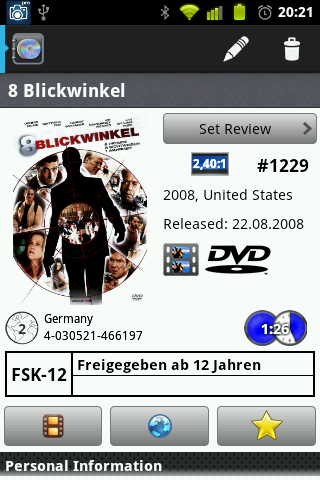
| | Posted: | | | | In the app, when entering a movie description. The movie run time is displayed as blue discs with white digits in front, resulting in unreadable end digits.
Thanks for a great app, have been looking forward to this for long time. Have installed it on both my samsung galaxy S3 (android 4.1.2) and my samsung galaxy tab 8.9 LTE (android 3.2) syncronized my collection using the "share" function in DVDP PC. Haven't had any problems what so ever.
Nice work! |
|
| Registered: March 31, 2007 |  Posts: 662 Posts: 662 |
| | Posted: | | | | Quoting filmglad: Quote:
In the app, when entering a movie description. The movie run time is displayed as blue discs with white digits in front, resulting in unreadable end digits.  It's perfectly readable to me. | | |  |
|
| Registered: March 13, 2007 | | Posts: 1,280 |
| | Posted: | | | | It's readable for, me too. Doesn't mean it's readable for everybody though, might have eyesight issues that make it difficult. | | | | IVS Registered: January 2, 2002 |
|
| Registered: March 31, 2007 |  Posts: 662 Posts: 662 |
| | Posted: | | | | Might be, or it might be there's a graphical glitch and the small shadow around the digits won't show up on his phone. That's why I added the screenshot. | | |  |
|
| Registered: May 19, 2007 | Reputation:  |  Posts: 6,730 Posts: 6,730 |
| | Posted: | | | | More likely:
Insufficient screen-resolution of the device. | | | It all seems so stupid, it makes me want to give up!
But why should I give up, when it all seems so stupid?
Registrant since 05/22/2003 |
|
| Registered: March 13, 2007 |  Posts: 2,692 Posts: 2,692 |
| | Posted: | | | | It isn't that clear on my phone either, so all it needs is to make the numbers a different colour so they show up better.
Or instead of a faint shadow put a black box round the numbers
Sounds an easy change with the next version.. which is when Ken?
And you might even fix the problem with some phones defaulting to US date format in dvd profiler whilst the phone is UK format dates.. | | | | Paul |
|
| Registered: March 31, 2007 |  Posts: 662 Posts: 662 |
| | Posted: | | | | Quoting Lewis_Prothero: Quote:
More likely:
Insufficient screen-resolution of the device. Might be, but having a lower screen resolution than I do, I guess it's not fun using this app at all. So what screen resolution do you have? Mine is 320x480... | | |  |
|
| Registered: March 13, 2007 | | Posts: 1,280 |
| | Posted: | | | | The tablet and phone mentioned by the original poster have a very high resolution around the 1280 x 800 mark...
I'm intrigued for more info from the original poster, as they don't specifically mention white on white as the issue, just refer to white on blue with end digits being unreadable. If it is actually white with a thin black border on white that's the problem then it's possible they have an issue with seeing low contrasts.
Or it may be as Standard suggested the outline is not displaying on their phone/tab, although it would be surprising with two totally different versions of the O/S running on different hardware.
Maybe a pure text based option should be provided for those who prefer it/find it easier to read. | | | | IVS Registered: January 2, 2002 |
|
| Registered: May 21, 2007 | | Posts: 18 |
| | Posted: | | | | Sorry if I was unprecise ... it's most a problem with white on white e.g. if the movie has a runtime 2:04 or like that. (made a screendump from my Samsung G3, but don't know how to upload it here) |
|
| Registered: March 13, 2007 | | Posts: 1,280 |
| | Posted: | | | | Thanks for clarifying.
To upload an image you need to click the second from right icon at the top of the post window (the one that looks like a mountain with the sun above it).
This will open a dialogue box that you pate the images URL into.
You need to upload the image to a third party image place first, e.g. photobucket and use the direct http url. | | | | IVS Registered: January 2, 2002 |
|
| Registered: May 21, 2007 | | Posts: 18 |
| | Posted: | | | | OK recognized the picture icon, but the url-path confused me  . But since this is my first need for a third party image place i don't bother creating an account. Although i can live with the runtime not being readable inside the movie profile since it also appears in the listing before entering a certain movie profile. .... probably bigger issues to be solved first. |
|
| Registered: March 13, 2007 | | Posts: 1,280 |
| | Posted: | | | | Photobucket offers four link types, one of which they call direct.
I can understand not wanting to sign up to something, but I've not had any issues with them personally.
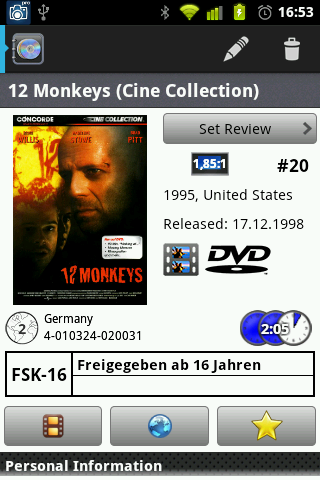
How does the runtime on yours compare to the one Standard posted earlier in the thread, i.e. does it look the same to you or is his version readable to you? | | | | IVS Registered: January 2, 2002 |
|
| Registered: March 31, 2007 |  Posts: 662 Posts: 662 |
| | Posted: | | | | Well, here's 2:05 on my phone:  | | |  |
|
| Registered: May 21, 2007 | | Posts: 18 |
| |
| Registered: May 21, 2007 | | Posts: 18 |
| | Posted: | | | | perhaps it has something to to with the font? |
|
| Registered: May 21, 2007 | | Posts: 18 |
| | Posted: | | | | Yes - the font has a say. The more "regular" the clearer the runtime is showing. Would still like the oportunity to deselect the blue discs in the background. |
|